America's Nightmare!
America is Going,
Going...Gone!
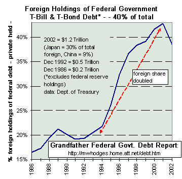
How could we Americans let this happen? How could we just do nothing? How in the world did we end up $37,000,000,000,000 in debt as a nation? Do you have any idea what this means in the future? It means that foreign nations are one day going to take over America by force to claim what is theirs. Much of America's debt is being financed by foreign nations through government bonds, et cetera.
So what happens when we go belly up (bankrupt) and can't pay them? That's right, the United Nations sends their troops onto America's streets, forcefully confiscates our guns, confiscates our property, and we become their slaves. We are in debt by our own stupidity, indifference and blind trust for the government. America deserves what she's going to get.
Can you imagine? We are paying over $40,000,000 AN HOUR just in interest.
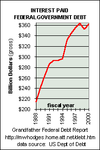
Every penny of federal taxes collected now goes just towards interest. In other words, we have passed the point where we can even hope to to one day be debt-free. This is all by design folks. The Federal Reserve is the most hideous and evil monstrosity ever devised. It is the evil invention of evil, greedy, and power hungry men. The Federal Reserve was created in 1913 by several independent bankers, including the Rockefeller family.
There is NOTHING "federal" about the Federal Reserve, it is PRIVATELY owned and operated (apart from any government or public control). And the Federal "Reserve" certainly has no gold reserve. We are all passing around "FIAT" (worthless) money. John F. Kennedy wanted to abolish the Federal Reserve with Presidential executive order 11110 and they killed him. You see, Kennedy was for the people and the globalist elite couldn't have that.
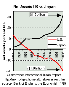
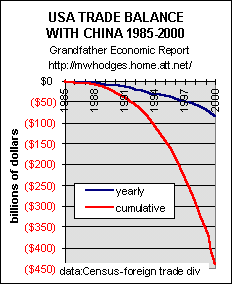
America is being depleted and destroyed little by little. So while foreign nations are increasingly getting wealthier, America is slowly getting poorer and poorer. Look at the chart below comparing the U.S. to Japan.
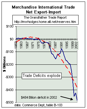
Americans are buying a whole lot more merchandise from other nations (484 billion more) than foreign nations are buying from us. In effect, they are getting richer and we are getting poorer. At the beginning it was utopia for greedy American businessmen and politicians, exploit the poor in other nations and share the loot. Consequently, the distribution of wealth is narrowing. Americans have lost tens-of-millions of high paying manufacturing jobs to third world countries. So while we're still paying full-price for a new car, poor people in Mexico are being exploited for a little over $1 an hour to build the cars. The people in China aren't so fortunate, they make around 25 cents an hour. Of course, all these foreign U.S. based companies avoid paying taxes on all their foreign goods as well. It's sickening.
I hope you don't plan on retiring because you may not be able to. Social Security is disappearing right before our eyes. If the government does privatize social security, you can kiss it goodbye. Why? Well, what is the stock market? It is basically Americans betting against Americans. The stock market is simply a tool by which wealth is redistributed (gambling). With a corrupt government that CONTROLS the stock market (read up on the "Exchange Stabilization Fund"), it's a fool's game. Our government is going to dupe you out of your Social Security. Of course, you can always invest your future into government bonds which are now paying less than ONE PERCENT.
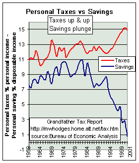
Americans used to be able to save money, not anymore. Taxes have increased and American piggy banks have gone anorexic. Save money? Ha!
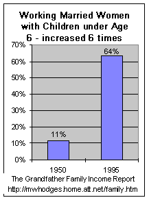
Never before in the history of America have so many mothers been forced into the workplace. During WWII, many wives were forced into the workplace to support the family while their husbands fought in the war. This was evil on the part of the government, working families should have had to support the families of soldiers serving their country in the military.
Consequently, women got used to working outside the home. Tens-of-thousands of families decided they liked the lavish lifestyle affording by TWO incomes once their primary bread-winner returned from the war. Of course, the wealthy elite didn't want too many American's getting ahead in the big world so they raised inflation until mother's were FORCED into the workplace (or else be forced live at or below the poverty line).
Today in America, mothers who decide to stay at home with their children are PUNISHED because the family can barely survive on one income (and many aren't surviving). Domestic violence has sky-rocketed, much due to pressures caused from lack of money. It's a shame that American families should have to suffer from lack of money, while decent paying manufacturing jobs by the tens-of-millions have been stolen away to foreign countries. You can blame your Benedict Arnold Ronald Reagan for this (and Bush Sr., Bush Jr., Clinton, congress, the senate, and a whole bunch more). Why did our government betray us? The reason is because many are greedy and evil people. The rest are moral cowards.
Why should God bless America? America has already been blessed but is losing her blessings quickly. God is not blessing America anymore, we are cursing ourselves. It is absurdity to expect God to bless any nation that disobeys the Word of God on a grand scale (abortion, feminism, gambling, prostitution, theft, murder, illegal drugs, pornography, hellivision, Hollyweird, Disney, homosexuality, drunkenness, smoking, witchcraft, astrology, psychics, palm reading, false religions, false prophets, land-grabs and other wrongful confiscations, lasciviousness, debauchery, transvestites, cross-dressing, fornication, adultery, tattoos, etc, etc, etc.). We are a nation devoid of God, yet we hypocritically expect God's blessings...No way!
"He that covereth his sins shall not prosper: but whoso confesseth and forsaketh them shall have mercy." -Proverb 28:13
Even America's pastors are sleeping and need to be woken up...
"For the pastors are become brutish, and have not sought the LORD: therefore they shall not prosper, and all their flocks shall be scattered." -Jeremiah 10:21
America is in sad shape spiritually, economically, and in every other way. We are very much like the Titanic, we've already struck the iceberg and we're slowly sinking into the depths of the abyss. It won't be long before U.N. troops are policing America's streets. We will lose our Bill of Rights. We will lose our right to bear arms. We will lose our right to privacy. We will lose our right to protest. We will lose our right to a fair trial. We will lose our freedoms. Even as I type, we have already lost much of our freedom. You will be forced to accept a National ID card. You are already a slave to the government whether you realize it or not. The 911 criminals will NEVER be brought to justice. More and more elections will be stolen, like the 2000 presidential election. It is wickedness.


END
Ok Sheeple, here's the source of my data below...we owe a big thanks to Michael Hodges for the following excellent work:
|
America's Total
Debt
Report - a chapter of the Grandfather Economic Reports - |
America has become more debt-dependent - - than ever before
with total debt of $37 trillion, or $128,560
per man, woman and child
and each added dollar of new debt produces less increased national
income
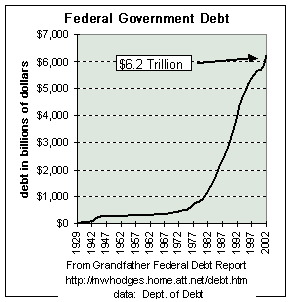
The Grandfather Economic Reports (http://mwhodges.home.att.net/) is a series of picture reports of threats to the economic future of families and their children, compared to prior generations. You are now at the chapter on Total National Debt trends. Welcome. We hope your visit will find useful information to help you and your loved ones.You may have previously viewed the historic pictures in the Federal Government Debt Report, which covers just the federal debt of $7 Trillion, or $24,000 per person. This chapter covers all U.S. debt, called America's Total Debt (defined as the sum of all recognized debt of federal, state & local governments, international, private households, business and domestic financial sectors, including federal debt to trust funds - but excludes the huge contingent liabilities of social security, government pensions, Medicare and other government off-budget items).
America Debt Total is now over $37 Trillion, or $128,560 per man, woman and child. This page tells the story with 11 pictures.
BIG PICTURE - - DEBT RATIOS - - DEBT PER PERSON - - EXCESS DEBT
DIMINISHED DEBT PRODUCTIVITY
MAJOR COMPONENTS of TOTAL DEBT REVEAL the CULPRITS
HOUSEHOLD DEBT - - DEBT SUMMARY TABLE
(graphics on household, business, financial sector and government debt from link bottom of page)BIG PICTURE - $34 TRILLION IN DEBT, and rising rapidly
and this excludes contingent liabilities such as social security, government pensions and Medicare. The economy is 2-3 times more debt-dependent - with at least $21 Trillion DEBT EXCESS - - compared to the 1950s
|
The
next 2 charts will show: first the debt in current dollars 1957 vs. today,
and then adjusted for inflation in 2003 dollars.
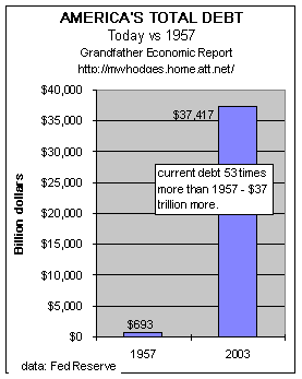
This chart compares total American debt today vs. 1957 in actual dollars. Total American Debt is defined as all U.S. debt (federal and state & local governments, international, and private debt, incl. household, business and financial sector). The chart shows the debt in 1957 was $693 billion (the left bar in the chart) - - or about $4,000 per capita Today's debt has grown above $37 trillion (the right bar in the chart)- - 36 times higher - - to $128,560 per man, woman and child - or $514,240 per family of 4. 65% ($24 trillion) of today's debt was created since 1990. |
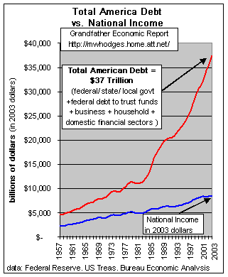
This is A SCARY CHART - showing 4 decade trends of America's total debt (the red line, reaching $34 trillion) vs. growth of the economy a measured by national income (blue line), adjusted for inflation in today's dollars.
America's Total Debt is here defined as all U.S. debt (sum debt of federal and state & local governments, international, and private debt, incl. household, business and financial sector, including federal debt to trust funds).
Note from 1957 to the early 1970s each curve approximately doubled - meaning about the same ratio of debt was supporting national income growth, despite paying on old WW II debt and covering Korean and Vietnam wars.
Had the economy become less debt dependent after that we would have expected debt to slow down. But, instead, it took off.
In just the 1990s real debt increased more than two times faster than growth of the total economy - - despite zero cold wars.
Other charts show the driving culprits were not only federal government debt ratios (which stopped falling in early 1970s and reversed strongly to the upside - growing 2x the economy) - but, not to be left out, other main culprits were accelerating household debt (growing nearly twice the rate of the economy, and domestic financial sector debt growth (at rates 4 times faster than general economic growth).
This chart clearly shows the accelerating reliance on debt to drive economic growth in the past 2 decades, compared to prior periods.
America's Total Debt today restated as a percentage of the economy is twice that of 1957, when we were dealing with debt left over from World War II plus the Korean War.
This chart shows the above total (government + private) debt as a ratio to the size of the economy in 1957 vs. today - - with the size of the economy measured by national income.
If total debt in America had not grown faster than the economy then the two bars on the chart would be the same height. But they are not the same height, because the debt ratio to economy size in that period increased over two times faster than growth of the economy - - indicating more than a 100% increase in debt dependence - - as it jumped from 186% of national income to a 427% debt ratio.
Stated another way, if 2003 debt had been at the 1957 ratio then 2003 debt would have been $16 trillion, not $37 trillion - - meaning an excess debt in America today of $21 trillion.
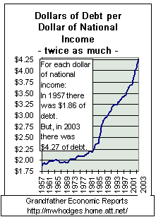
Stated differently, in 1957 there was $1.86 in debt for each dollar of national income, but today there is $4.27 of debt for each dollar of national income. It also means that this extra $2.41 of debt produces zilch relative national income.
This chart implies today's economy has more than double the debt load in relation to economy size, as was the 1957 economy. Not only is this ratio difference very large, but the 1957 economy was still paying off World War II debt (and carrying parts of the Korean war).
Restated - it took twice as much debt per dollar of national income in today as was required in 1957.
There can be little doubt (from this chart) that our economy is significantly more debt-dependent than ever before - - and that the economy can have a major negative impact should interest rates rise significantly or the economy slow down.
The chart at the left looks at debt ratios to economy size for all in-between years: 1957 to now.
If the years after 1957 required no more debt per dollar of national income, then the black curve in the chart would have remained flat - at the 186% level. But, as the years went on, especially after the late 1960s, it took more debt each year than the year before to produce a dollar of national income.
By 2003 Total America debt reached a historic peace-time record at 427% of national income - - more than double the share of economy that was debt laden in 1957. This picture makes quite clear that today's economy is over 100% more debt dependent (leveraged) than before.
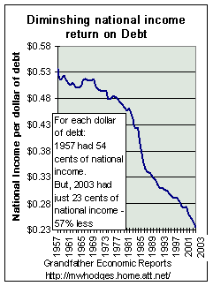
Restated - - in 1957 a dollar of debt produced 54 cents of national income; but today's dollar of debt only produced 23 cents of national income - or 57% less economic growth per added dollar of debt.
The black line is our data. The red dashed line is the exponential trend line. Note in the more recent years, not only has the black line increased at a faster rate, but it is now growing at a rate above the red exponential trend line.
And, this faster debt ratio climb is occurring despite so-called higher levels of economic growth in the 1990s, and record tax collections.
Snap Shot - - today vs. 1957
America's Total Debt restated as inflation-adjusted per person - - 4.6 times too much.
This chart shows total total debt allocated on a per capita basis, adjusted for inflation. The left bar shows 1957 debt nation-wide (in today's dollars) was $26,381 per man, woman and child.
If national debt per person were only adjusted for inflation over the 45 year period, the right bar (2003) should have remained the same size as the left bar (1957) at $26,381 per capita.
BUT- the right bar shows 2003 debt was $128,560 per man, woman and child - - 5 times higher per capita than in 1957.
Adjusted for inflation, this data shows inflation-adjusted total debt load per person increased $102,179 - - equivalent to an increase of $408,716 per family of 4.
Year to year 1957 to today -
This chart shows the full year to year trend of the above chart's total American debt(adjusted for inflation) on a per person basis, with all the years shown.
Per capita real debt has increased from $26,381 in 1957 to $128,560 today - - 5 times more debt per person, adjusted for inflation.
Note the very steep upward thrust of the curve for more recent years - -
- - as if current debt trends are up faster than a rocket boost from Cape Kennedy.Note: all debt data is from the Federal Reserve, except the data for the federal government portion of the total is from the Dept. of Debt at the Treasury Dept. which also takes into account federal debt owed to the trust funds. National income data is from the Bureau of Economic Analysis.
EXCESS AMERICAN DEBT is $17-25 Trillion (adjusted for inflation).
Let us calculate the excess debt in today, compared to 1957 - - via 2 methods.
This chart looks at the $37 Trillion of total debt in America today (the left bar in the chart) and asks the following question > >
What would be the size of today's debt had the economy operated at the same debt ratios (to national income and per capita, adjusted for inflation) today as it did in 1957?The chart's middle bar displays the excess based on % national income method: today's (2003) debt would have been $16.32 Trillion if the economy and been no more debt-dependent than it was at the 186% debt ratio to national income of 1957.
But, actual debt was $37.42 Trillion - - more than twice as much. The difference between the two bars is an Excess Debt in 2003 of $21 Trillion ($37 less $16). This excess alone is equivalent to $72,000 per man, woman and child - - in excess debt load - - or $288,000 excess debt load per family of 4.
The chart's right-hand bar displays the answer for per capita debt excess: today's debt would have been $7.21 Trillion if today's debt per capita had been the same per capita ratio as 1957 - - both in constant 2003 dollars. But, it was $37 Trillion, or 5 times more.
The difference using per capita measurements indicates 2003s excess debt was $30 Trillion ($37 less $7) too much.
That's an excess of $103,000 per man, woman and child in excess debt load - - or $412,000 per family of four excess load.
SUMMARY: this chart shows that total debt in America in 2003 carried an excess between $21 and $30 Trillion too much - - or $72,000 to $103,000 per person too much - - or $288,000 to $412,000 per family too much.
AMERICA'S DIMINISHED DEBT PRODUCTIVITY
If America was more efficient in real productive employment
of new debt
then less debt would be needed for each dollar of national income.
But - - the reverse is true. We are less productive regarding debt than ever
before.
| Each dollar of economic growth requires more debt per dollar than before - now over twice as much | and, the national income achieved per dollar of debt dropped 57% |
 The
left chart restates the above. The
left chart restates the above.
It shows that in 1957 there was $1.86 of outstanding debt for each dollar of national income. But, today's economy needs $4.27 in outstanding debt for each dollar of national income. That's double the outstanding debt load per dollar of national income. That extra $2.41 of debt produced zero national income. |
 The
left chart shows the reciprocal - - and the diminishing returns resulting
from debt. The
left chart shows the reciprocal - - and the diminishing returns resulting
from debt.
It shows the declining amount of national income achieved by the economy for each added dollar of debt. In 1957, 54 cents of national income resulted for each dollar of debt. But, today only 23 cents of national income resulted per dollar of debt. That's a 57% drop in national income per added dollar of debt. |
| The left graphic above looks at total debt
outstanding vs. national income at end of each year, which is the correct
long-term approach.
However, if we look at differences for just one year, 2002 vs. 2003, $2.95 trillion of new debt was added in 2003 yet national income that year increased just $296 billion - - meaning in 2003 alone it took $10 of newly added debt to produce each new dollar of national income - - a huge figure, which helps explain the soaring trend above. |
|
COMPONENTS OF AMERICA'S TOTAL DEBT
IDENTIFYING THE PRIME DEBT-GROWTH CULPRITS
- a most sobering and scary picture
The Prime Debt Culprits are:
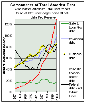
Federal Government - Financial sector - Household sector - Business sectorFollowing is a very revealing chart, compressed to show just the past 29 years (1972-2001). It shows 5 major components of debt in America - the debt amount of each as a ratio to the size of the economy's national income.
The 5 lines include State & Local government, Household debt, Business Sector debt, Domestic Financial Sector debt and the total federal government debt. Not shown is international debt, which is covered in the International Trade Report.
We know from the above charts that total ratios are up exponentially. This chart identifies those components driving the upward trend in debt ratios in all government and private sectors.
Look for the lines that are rising - - like the red line (exploding financial sector debt), the blue line (rapid increases in Household debt ratios), the black line (Federal Government) and the yellow line (business sector). The fact these 4 lines rise means debt in these sectors increased significantly faster than the economy was growing. These are the driving force now threatening the American economy with sky-rocketing debt-dependence.
The most dramatic & scary is the red line, which is Financial sector debt (today at $11.4 trillion) - a very scary trend!!! (Although much of the financial sector debt is also included in the other categories, most also agree that the business debt category understates its own debt, as evidenced by off-balance sheet debts of the likes of Enron, etc.- - an area of hidden debt still coming to light. Therefore, it is instructive to include financial sector debt).
- As shown on the chart's red line, the financial sector's debt ratio zoomed from 5% of the economy's national income in 1957 to 130% of today's economy - a debt ratio growth rate 26 times faster than general economic growth - and, pointing upward faster and faster.
- A separate chart on this component follows below, which shows its trend line is upward exponentially.
The next largest rapidly rising component is the blue line, or Household debt ($9.4 trillion) - from 43% of national income to today's 101%, more than double the prior ratio - meaning it, too, is growing much faster than general growth of the economy.
Household debt is made up of consumer debt plus mortgage debt. The Family Income Report shows real median family incomes stopped growing in 1970, and thereafter families tried to keep up by going deeper and deeper into debt ever since - at near twice the rate of total economic growth - to an all-time high today. Consumer debt payments % disposable income are at historic highs. The Family Income Report cites the reason, with dramatic pictures.
The fact household debt ratios have reached historic highs during the so-called boom years of the 1990s proves that the economy was more driven by debt than anything else - - and households have excessive debt instead of reduced debt at end of an expansion period.
Next there is the black line, the Federal government sector debt ratios -
- We have seen this before. It was pointing downward 1950s to mid 1970s (see Federal Debt Report) - a period of strong real median family income growth, stopped dropping in 1974, oscillated, and then took off upward - under the pressure of consumptive social spending rising 12 times faster than the economy as reported in the Federal Spending Report (as family incomes ceased to climb).
- Today's ratio (80%) is double that of 1972 when the Vietnam war and the cold war were in process. The recent short down turn was due to record tax revenues, and a dramatic lowering of national security expense ratios to a near record low as a share of the economy - - but, now reversing to the upside as the depleted military is re-built.
- Some of the reasons are in the Social Security Report, which shows how the general government dips into trust fund surpluses, siphons such off for non-pension spending (leaving behind a few worthless IOUs), and then does not account for such spending in the way the budget deficit is calculated. The same siphon and spend approach occurs in other trust funds, such as the federal employee pension trust fund. Together, $2.6 trillion has been siphoned from trust fund, with zero budget to reduce other general government spending to repay.
The business sector debt (yellow line) of $7.4 trillion increased twice the speed of the economy, increasing from 44% of national income in 1957, doubling to over 84% today - an all-time high.
The green line (debt of state & local governments) is the only component not rising. Although its debt may have moderated, the State & Local Government Report proves spending and headcount ratios are way out of line, compared to the past, and this sector needs major attention.
The left chart shows the trend of household debt as a share of national income from 1963 to present. If household debt were not growing faster than the economy's own growth then this chart would show a flat, horizontal line. But, the chart plot is straight up in recent years, meaning household debt is soaring faster than the economy.
Household debt is primarily made up of mortgage debt and credit (credit cards, auto loans, etc.). In 2003 household debt was up 11% over the prior year to $9.4 trillion, incl. $6.8 trillion mortgage debt and $2 trillion credit debt.
Note the left side of the chart for the first several years where the debt ratio did not increase, until the late 1970s.
It then started upward, slowly - and then upward like a rocket - to new all time highs today.
Debt has risen at rates much faster than growth of the economy, suggesting real equity is not the driving force of economic size - - it is debt driven.
If today's debt ratio (101% of national income) had been the same as in the earlier years, the chart's curve would be horizontal instead of soaring upwards, and then today's debt in dollars would have been $5 Trillion less than it was in 2003. In other words, 2003 household debt would have been $4.3 Trillion - - not the $9.4 Trillion that did occur.
This shows that the economy is more leveraged by household debt than ever before. And, households are even more at the mercy of credit and mortgage interest rates than ever before.
Auto loans > In addition to soaring home equity mortgages which consume owner stakes in their homes, according to USAToday (2/16/04) the average automobile loan today is for 63 months, with some going as high as 80 months, compared with an average of less than 48 months five years ago - - and about 24 months in the 1950s. In 1997, banks financed an average 89% of a new vehicle's price. Last year, it was 101% since consumers borrowed to cover the amount they were upside down on their trade-in. And get this…40% of all trade-ins involve upside-down car loans. (this author recalls when he entered the workforce in the late 1950s normal down payment was on-third cash for a car, with 18 month financing for the balance. Quite a contrast to current times.)
Credit Cards > A massive 42% of Americans are making just minimum payments or no payments on their credit card balances, according to the Cambridge Consumer Credit Index in March 2004. Of those respondents surveyed with revolving balances on their credit cards, 39% made only the minimum payment due and 3% made no payments at all last month. Another 39% paid less than half the balance owed but more than the minimum, while 19% paid more than half their balances. In 2003, the average credit-card debt of US households with at least one card was $9,205, up from $2,966 in 1990, according to the research firm CardWeb.com - - that's 310% higher.
NOTE TO READER > More household debt graphics and info, including color data trend graphics on business and the finacial sector and government sector on the next page, from link bottom of this page.
WHAT IS TO HAPPEN TO THE YOUNGER GENERATION AND FAMILIES?
How can such debt trends be sustained - - considering the Grandfather Family Income Report shows 2 ½ decades of stagnant real median incomes for families, as income of full-time working males has fallen for more than a decade?
The Tax Report shows citizens work 3 times longer to pay all taxes each year, as government in recent years have been raking in tax revenue at the fastest rate in peace-time history - - which depresses family spending options leading to increased household debt to make up.
The State & Local Government Spending Report shows they have added employees at a rate faster than growth of the nation's population, with a new record high last year. Most citizens have learned that each working person today supports more seniors than ever before, but few know they also carry on each of their backs 3 times more state & local government employees per head than before.
Additionally, if families are consuming their home equity (while prior generations saved theirs) yet the Grandfather Social Security Report shows these families can expect much less in pension benefits when they retire than their elders - - how can this be sustained?
And from where comes family funds to support higher education for the children of younger families - - especially considering college cost inflation and degradation in high school output quality, as covered in the Grandfather Education Report? Tremendous increases in inflation-adjusted public spending per student, while test scores compared to other nations place the USA at the bottom of the heap, waste and drain of individual and national resources. Net result: families and students take on more college debt than ever before.
Further, said generation faces global competition for their living standards more so than any generation in U.S. history against many competitors better educated than they as shown in the International Education Report.
AND - - America, that used to be the biggest creditor on earth is now the biggest international debtor with exploding trade deficits, as shown in the Grandfather Foreign Trade Report,
AS debt soars America's energy infrastructure has deteriorated and especially its independence regarding petroleum and natural gas, as covered in the well-documented Energy Report with extensive graphics of production vs. consumption vs. imports vs. reserves.
Let's summarize our findings in a simple table - - as follows:
BOTTOM-LINE - - DEBT SUMMARY TABLE
|
||
|
DEBT TYPE |
DEBT AMOUNT |
Debt Per Child |
|
GOVERNMENT SECTOR DEBT: |
||
| Federal Government Sector debt - a record high (Treasury data and Federal Government Debt Report, (includes $1.5 trillion federal govt. owes foreigners, plus $2.5 trillion debt owed U.S. domestic public, plus the $3 trillion surplus siphoned from and owed to trust funds) |
$7 Trillion | $23,000 |
| State & Local Government Sector debt - a record high (State & Local Government Spending Report) |
$1.6 Trillion | $ 6,000 |
| Un-funded Social Security contingent liabilities estimated looking forward * | $7 Trillion | $23,000 |
| Un-funded Medicare contingent liabilities, estimated * | $37 Trillion | $128,000 |
| Un-funded federal employee pension and medical contingent liabilities (incl. Postal service) |
? no estimate |
? |
| Un-funded state & local government employee pension & medical contingent liabilities |
? no estimate |
? |
| Other off-budget Federal Govt. borrowings* |
? |
? |
|
SUM above Government Debt |
$52.6 Trillion + ? |
$182,000 +? |
|
PRIVATE SECTOR DEBT: |
||
| (see the America's Total Debt Report) | ||
| Household Sector debt - soaring record high | $ 9.4 Trillion | $32,000 |
| Business Sector debt - record high | $ 7.4 Trillion | $26,000 |
| Financial Sector debt (domestic) - explosive record high | $ 11.4 Trillion | $40,000 |
| Other (extra foreign debt in addition to such included in numbers above sectors) | $ 0.7 Trillion | $ 2,000 |
| Un-funded business sector employee pension & medical contingent liabilities |
? |
? |
| Impact trillions of dollars of derivatives on business & financial sector debt |
? |
? |
|
SUM above Private Debt |
$28.9 Trillion + ? | $100,000 + ? |
|
- - |
- - - - | - - - - |
|
SUM Government + Private Debt (including Contingent liability items*) |
$81.5 Trillion +? | $282,000 +? |
|
SUM Government + Private Debt (excluding contingent liability items*) |
$37.5 Trillion | $128,560 per person |
| * for discussion some of above government items, see the Grandfather Social Security Report, the America's Total Debt Report and Trust Fund Report. (Debt Data Sources: Federal Govt. from Treasury Dept.; Private Sector and State & Local Govt. from Federal Reserve flow of funds accounts, table D.3) | ||
CONCLUSIONS
- As America began to 'invent' new reasons for larger government than defined by its founding forefathers as the 4 principle purposes of government, government spending increased faster than economic growth, primarily fueled by zooming social program spending, much caused by Social Security & Medicare - and the share of the economic pie remaining to the private sector was reduced. Government spending ratios increased for the federal government, and state & local government spending increased faster than the economy and its employee head-counts faster than the population. As of today, the federal government spending ratio has reached 25% of national income - representing 10 times more growth in government spending than growth in the economy since1930. And, state & local government spending now consumes 15% of the economy, three times higher than after the 2nd world war.
- National productivity and savings started a long down-trend and by 1970 real family incomes stopped rising and stagnated - as earnings of full-time males declined, singling the end of the on-wage earner family as more mothers were sucked into the workforce (away from their children) trying to help make up the difference - as each working person had to support more seniors and more state & local government employees than ever before - -and what we used to know as 'family values' begin to decline.
- Education Productivity (relationship of output quality to per student real spending) started a long-term slide in the 1960s, dropping 71% over the next 3 decades. Helped by changing measurement criteria, this 'rate' has improved somewhat in last 2 years.
- As a result of such government expansion, government entities increased mandated regulations on the private sector, at accelerating regulatory compliance cost loads on the economy and its productivity and savings. Today's compliance costs consume 16% of the total national income.
- Following the above, inflation rates jumped - - and today are still higher than during the period of strong family income growth when inflation was measured by more stringent methods.
- The nation's Trade Balance went steadily negative starting in then 1970s - and today America is the world's largest debtor nation - - with increasing deficits each year to a new all-time record deficit today.
- And, the International Value of the U.S. dollar may again be threatened by exploding trade deficits, as it was before.
- The graphics in this America's Debt Report prove that the nation, trying to maintain and expand consumption (instead of producing real goods and savings) begin to go more and more into debt, in relation to the size of the economy. Federal Government Debt ratios, after falling since World War II stopped falling and then soared to the highest peace-time ratio in history. Families, trying to keep up under the squeeze in the economy and of education quality, went more and more into debt, causing Household debt ratio (charts above) to grow twice as fast as the economy since the mid 1970s when family incomes stagnated - and are rising exponentially as of today.
- Debt of the Financial Sector (charts next page) accelerated, now expanding exponentially to the highest ratios in history.
- And - - America's debt productivity, less and less national income per added dollar of new debt outstanding, has significantly deteriorated.
- As debt soars in America citizen voter turnout deteriorates, as does trust in government and family confidence in their future.
America, that used to derive strong family incomes and values from producing real goods and savings, even with one bread earner per family, has moved to a fully consumptive society financed by ever increasing ratios of debt at private and government levels, with nil savings - - with debt ratios reaching new records - - with each added dollar of debt producing diminishing amounts of national income.
AMERICA HAS BECOME LESS A FAMILY-BASED, FRUGAL AND PRODUCTIVE SOCIETY WITH SMALL GOVERNMENT - - AND MORE A CONSUMPTIVE, PERMISSIVE, DEBT-DEPENDENT AND GOVERNMENT-DEPENDENT SOCIETY THAN EVER - - A BECOMING QUITE DIFFERENT THAN THAT ENVISIONED BY ITS FOUNDING FORE-FATHERS. WE ARE AT A CROSS-ROAD. OUR YOUNG GENERATION FACES EXTREMELY SIGNIFICANT CHALLENGES IN THIS REGARD - - AND MAY BE LESS PREPARED TO MEET THE APPARENT FUTURE THAN ANY PRIOR GENERATION IN RECENT HISTORY
America may experience a crisis of economic un-sustainability.
But - will citizens fight back from the grass-roots to retake her proud heritage of the past. Will leaders come forth that do not scream: growth-growth-debt-debt? There is much to be done, because there is much at stake.
The purpose of the Grandfather Economic Reports is to increase public awareness
of major threats facing today's families and youth - compared to prior generations.
KNOWLEDGE IS POWER - IF YOU HAVE IT
Wall Street " The Mark" is Here
The Guilty Fed and Feds (by Congressman Ron Paul)
Communism and the New World Order: Wall Street's Utopian Hoax
Dirty Secrets of the Federal Reserve
Abolish the Federal Reserve (by Congressman Ron Paul)
The Disappearing Dollar (by Congressman Ron Paul)
Quotes On the Diabolical Federal Reserve System
The United States is in Deep Doo Doo!